Side-by-Side Layout
Description
Creates responsive two-column layouts that automatically stack on mobile devices. Perfect for comparing content, showing before/after examples, or organizing related information.
Usage
Wrap content in a container with class .side-by-side. Each direct child becomes a column. Content automatically stacks vertically on mobile devices.
Available Options
- CSS Classes:
.side-by-side- Main container for two-column layout.align-top- Aligns columns to the top.align-bottom- Aligns columns to the bottom
- Responsive Behavior:
- Desktop: Two equal-width columns
- Mobile: Stacked vertically
- Automatic spacing and alignment
Examples
Basic Side-by-Side Layout
Left Column
This is the left column content. It can contain any HTML elements including text, images, lists, and other components.
- List item 1
- List item 2
- List item 3
Right Column
This is the right column content. Both columns have equal width on desktop and stack vertically on mobile.
You can include multiple paragraphs, images, or any other content in each column.
Side-by-Side with Images

Before and After Comparison
Before

After
Side-by-Side with Top Alignment
Short Content
This is short content.
Longer Content
This is longer content that extends beyond the short content.
It includes additional paragraphs to demonstrate how the top alignment works when content heights differ.
- Additional list item
- Another list item
Side-by-Side with Bottom Alignment
Short Content
This is short content.
Longer Content
This is longer content that extends beyond the short content.
It includes additional paragraphs to demonstrate how the bottom alignment works when content heights differ.
- Additional list item
- Another list item
Side-by-Side with Mixed Content
Process Overview

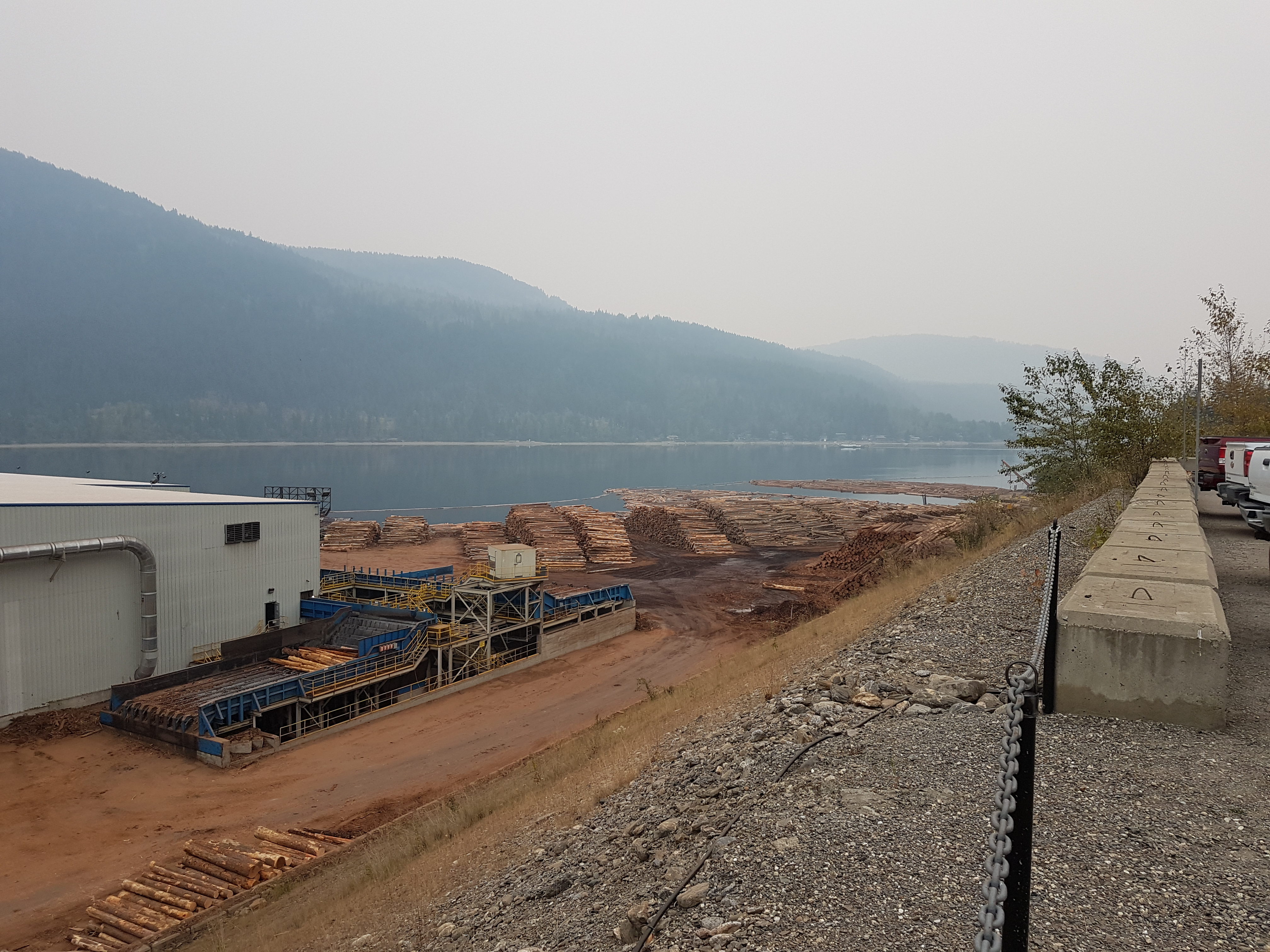
This image shows the complete lumber processing facility from a wide angle view.
Key Components
- Raw material storage area
- Processing equipment
- Quality control station
- Finished product storage
Each component plays a crucial role in the overall process.
Nested Side-by-Side Layouts
Left Section
Sub-section A
Content for sub-section A
Sub-section B
Content for sub-section B
Right Section
This is the right section with its own content.
Side-by-Side with Interactive Elements
Learning Content
Activity
Complete the following steps:
- Read the instructions carefully
- Complete the activity
- Submit your work
Assessment
-
What is the primary purpose of a log yard?
- *Storage of raw materials
- Processing equipment
- Quality control
Notes
- Each direct child of
.side-by-sidebecomes a column - Columns have equal width on desktop screens
- Content automatically stacks vertically on mobile devices
- Use
.align-topto align columns to the top - Use
.align-bottomto align columns to the bottom - Default alignment centers columns vertically
- Side-by-side layouts can be nested within other layouts
- Works well with figures, activities, and other content types
- Responsive design ensures good mobile experience
- Perfect for comparing content, showing processes, or organizing information
- Maintains consistent spacing and visual hierarchy